A weekly shopping ritual, cut down to a few taps.
Mi Plaza aggregated local vendors into a single app, cutting the time and friction out of weekly shopping for busy millennials. I led UX design and brand strategy end to end, from research through a 30-week build to first release.
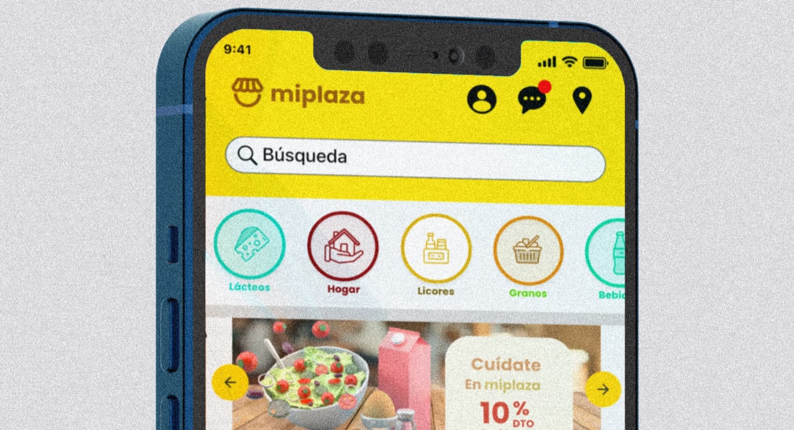
- Role
- Lead UX Designer & Brand Strategist
- Company
- Mi Plaza Digital
- Timeline
- 30 weeks to first release
- Platform
- iOS & Android
Problem
Fragmented vendors, long store lines, and unclear delivery windows discouraged busy millennials from shopping often, or well.
Solution
A single app aggregating local vendors, with an optimized checkout flow and reliable delivery windows, cutting shopping to a few taps.
Impact
30% faster order completion. 22% higher 4-week retention. 4.7/5 satisfaction from pilot users.
Context
Designing for people with no time to spare.
Mi Plaza Digital brought me on as lead UX designer and brand strategist to simplify the weekly shopping ritual for busy millennials, by aggregating local vendors into a single, intuitive app. The goal was straightforward to state and hard to build: cut the time and frustration out of buying essentials while increasing convenience and satisfaction.
The brief covered brand identity, product design, and go-to-market, end to end, across a 30-week timeline to first release on iOS and Android.
The Problem
How do you make grocery shopping fit into a life with no free time?
Millennials juggle work, family, and personal pursuits, leaving little time to plan shopping or search for deals. Fragmented vendor options, long store lines, and unclear delivery windows created friction that discouraged frequent use. Mi Plaza needed a seamless way to unite local products and reliable delivery, so shopping could feel as effortless as a few taps.
Research
Meet David.
I ran ethnographic research to pinpoint the time-drain pain points in existing grocery apps, then validated information architecture and surfaced user friction through rounds of usability testing with 15 participants.
- Monthly users (2019-2020)
- 30,000
- Total reach
- 200,000
- Deliveries in first MVP
- 30,000

- Age
- 23
- Occupation
- Student
- Status
- Single
- Location
- Valledupar, CO
Description
David Ospino is an architect student born and raised in Valledupar, Colombia, with a long history of using food delivery apps. He belongs to Millennials, our target population, people who don’t have much time to build a recurring shopping list and get frustrated by how time-consuming it is. Mi Plaza eases the path consumers follow to buy basic family-basket goods.
Personality
Tags
Pain points
- Wants a broader product catalog.
- Payment is limited to cash or card only, no other alternatives.
- Wants a wider range of offers on other products.
- Loses time selecting products during the shopping process.
- Delivery windows are limited to 7 a.m. to 7 p.m.
Value Proposition
Mi Plaza is a mobile app for buying a recurring shopping list in under three steps, finding the best deals efficiently, with home essentials delivered in under 30 minutes.
Potential Pitfalls
Apps like this no longer limit themselves to delivery. Rappi already handles adjacent services like insurance, and iFood offers a more intimate, personal shopping experience. The open question: how much of that scope should Mi Plaza take on to stay competitive?
Influencers
Rappi, iFood, and Uber Eats, the apps already shaping what users expect from delivery and convenience.
MVP: Targeted User
Young people and homemakers pressed for time buying and consuming basic household needs, who look carefully for specific products in their family basket, exactly who Mi Plaza was built to help.
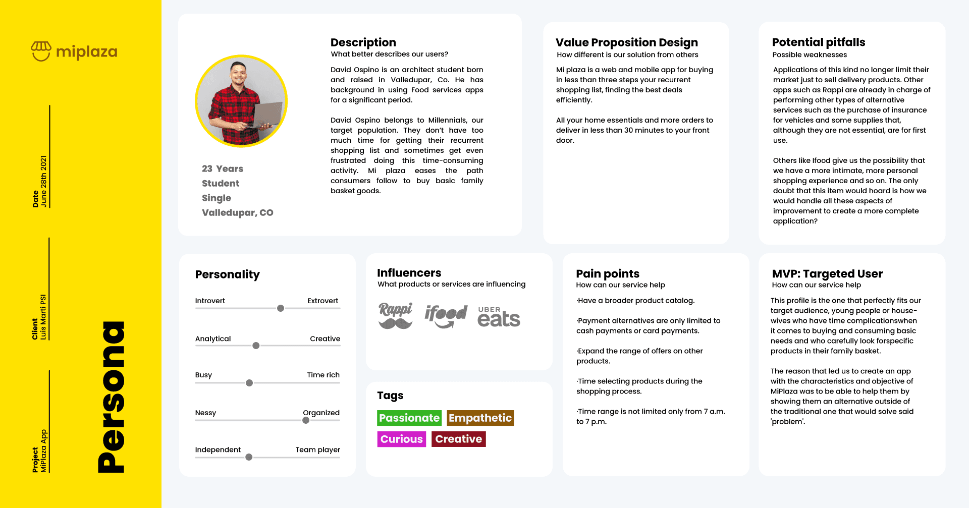
The original persona canvas, the same description, personality, pain points, and target-user breakdown presented as structured content above.
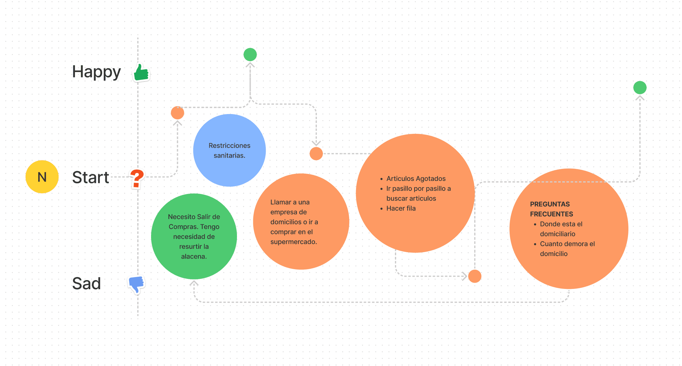
The emotional journey I mapped for a pre-Mi Plaza shopping trip: starting neutral, dipping through pandemic health restrictions, out-of-stock aisles, and checkout lines, and only recovering once the order is confirmed, the exact friction the product needed to remove.
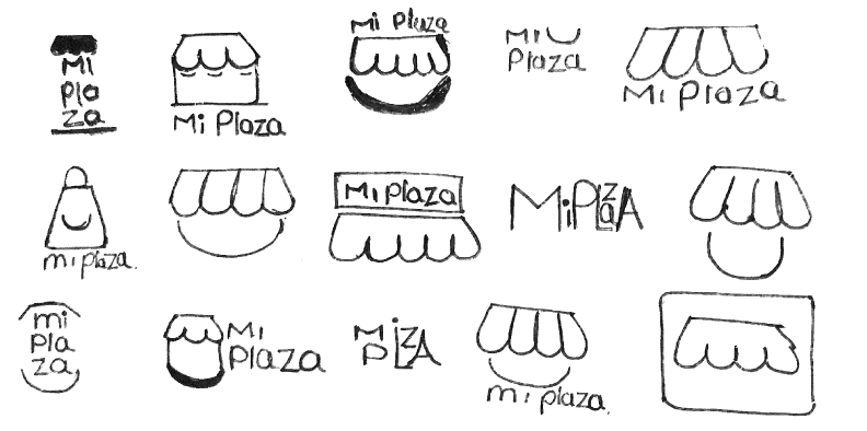
Early hand-drawn exploration of the Mi Plaza mark, iterating on the storefront-awning motif and wordmark before landing on the final logo.
Approach
Five phases, one design system for the whole team.
We built a UI kit with text styles, motion guidelines, and a color palette shared across designers and developers, so the product stayed consistent as the team shipped fast.
Ethnographic Research
Conducted ethnographic research to pinpoint the time-drain pain points in existing grocery apps, using interviews, benchmarking, and Google Trends to validate the user persona.
Brand & Visual Language
Designed the brand identity and visual language to convey trust and speed, backed by a value proposition design and business model canvas.
Journey Mapping
Mapped the customer journey and optimized flows to minimize steps from selection to checkout, using card sorting and rapid wireframing.
Build
Collaborated with developers to implement an intuitive interface across iOS and Android, releasing the product in staged epics with product managers.
Test & Iterate
Led user testing rounds with 15 participants, iterating the design system and UI kit based on real feedback across releases.
- Methods
- Research, IA, Usability Testing
- Timeline
- 30 weeks, first release
- Management
- Scrum / Kanban
- Tools
- Figma, User Testing
Inside the app
Buy your recurring list in under three steps.
Mi Plaza let users buy their recurrent shopping list in less than three steps, finding the best deals efficiently, with home essentials delivered in under 30 minutes.
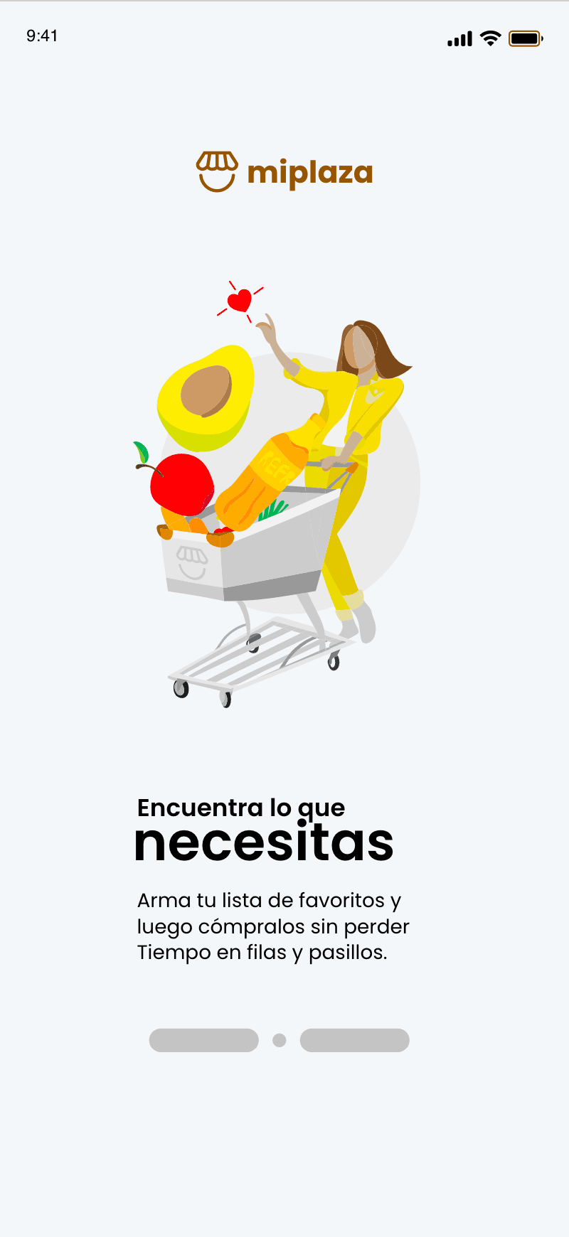
Onboarding
Sets the value proposition, find what you need, before the user ever sees a product grid.
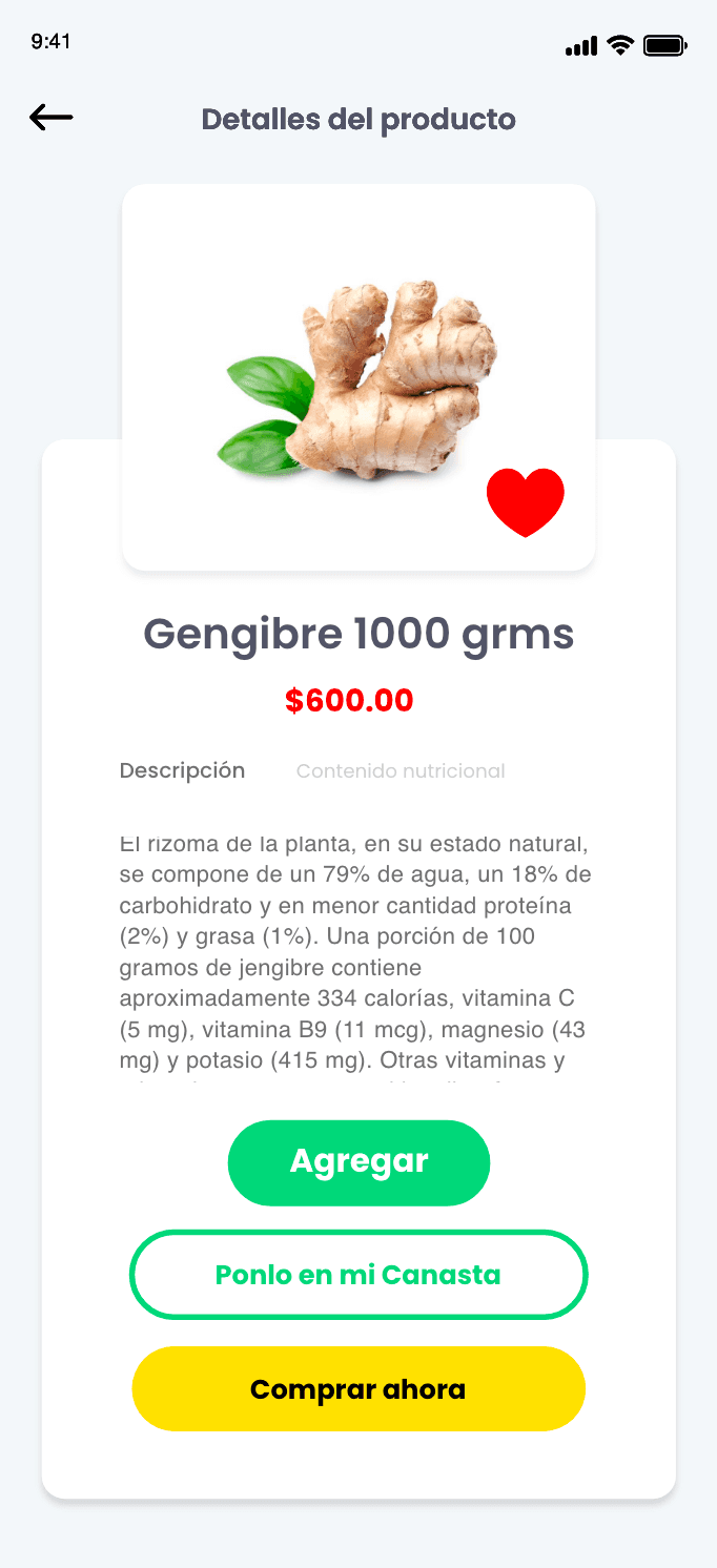
Product Detail
Full nutritional description and three ways to act, add, save for later, or buy now.
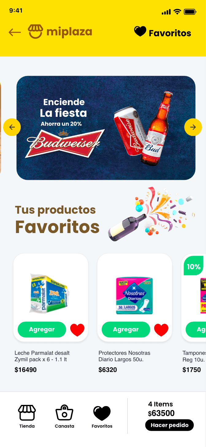
Favorites
One tap added recurring monthly purchases to the cart, saving time and building rapport with the app.
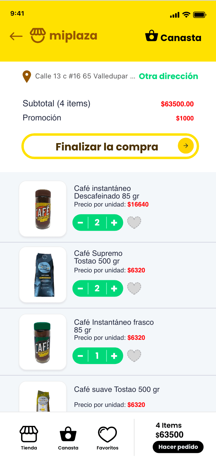
Basket
Subtotal, promotions, and checkout visible together, no surprise costs at the end.
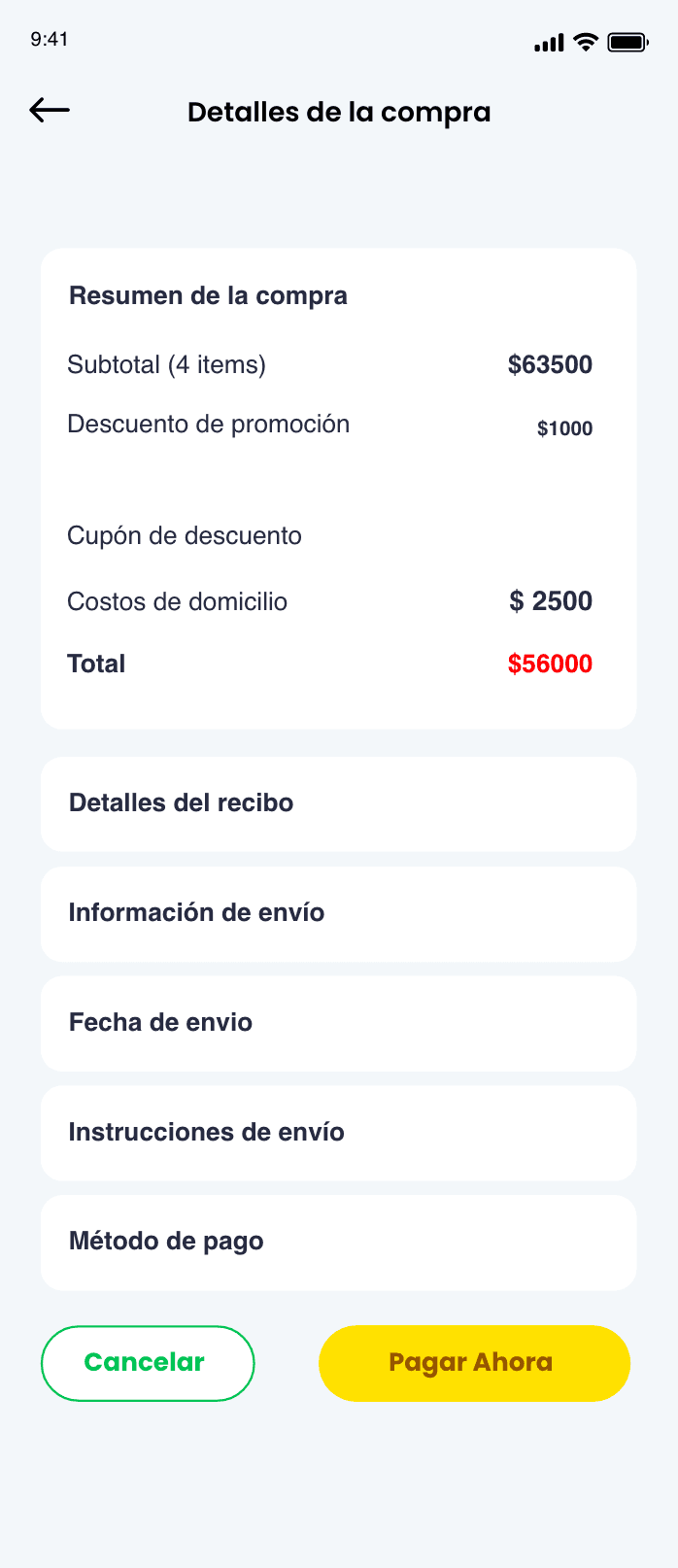
Checkout
Order summary, delivery cost, and payment method confirmed before the charge goes through.
Walkthrough
A full pass through the shopping flow, screen by screen.
Mi Plaza Digital
“Luis is a great designer and mentor. He helped me start MiPlaza.co, and designed the original website and the logo. Recently, he designed the new version of the mobile app. He is great in what he does.”
Entrepreneur at Mi Plaza
Impact
Measurable gains in engagement and loyalty.
30%
Reduction in average time to complete a weekly order.
22%
Increase in user retention after four weeks.
4.7/5
Average satisfaction score from pilot users.
18%
Expansion of the vendor network within the first three months.
Prototype
Click through the flow yourself.
An interactive prototype of the Mi Plaza flow, built in Adobe XD.
Closing note
By focusing on a single pain point, saving time for busy customers, Mi Plaza turned grocery shopping into a frictionless, one-stop experience.